Craigslist is a free online bulletin board for local communities. Users can post almost anything, from selling a house, to putting up a dating profile, ranting about politics, or offering a job. This eclectic combination of use cases seems to make Craigslist a useful tool, but its abysmal user experience—the result of an inconsistent brand, a confusing content structure, and a difficult to scan interface—reduces its ability to deliver on its brand promise.
Craigslist is a free online bulletin board for local communities.
My content audit revealed a shallow content structure, with 237 pages accessible on the homepage alone, some of which are only accessible through the homepage. This shallow structure forces users to rely on search features, experience frustration, and feel overwhelmed by the number of options available. In addition, the support pages are repetitive and misleadingly named.
After mapping out the content, I realized I could group of Craigslist’s content by users’ intent: shopping, working, experiencing community, and finding help. These groupings simplify the experience and help users fulfill their purpose in navigating to the site.
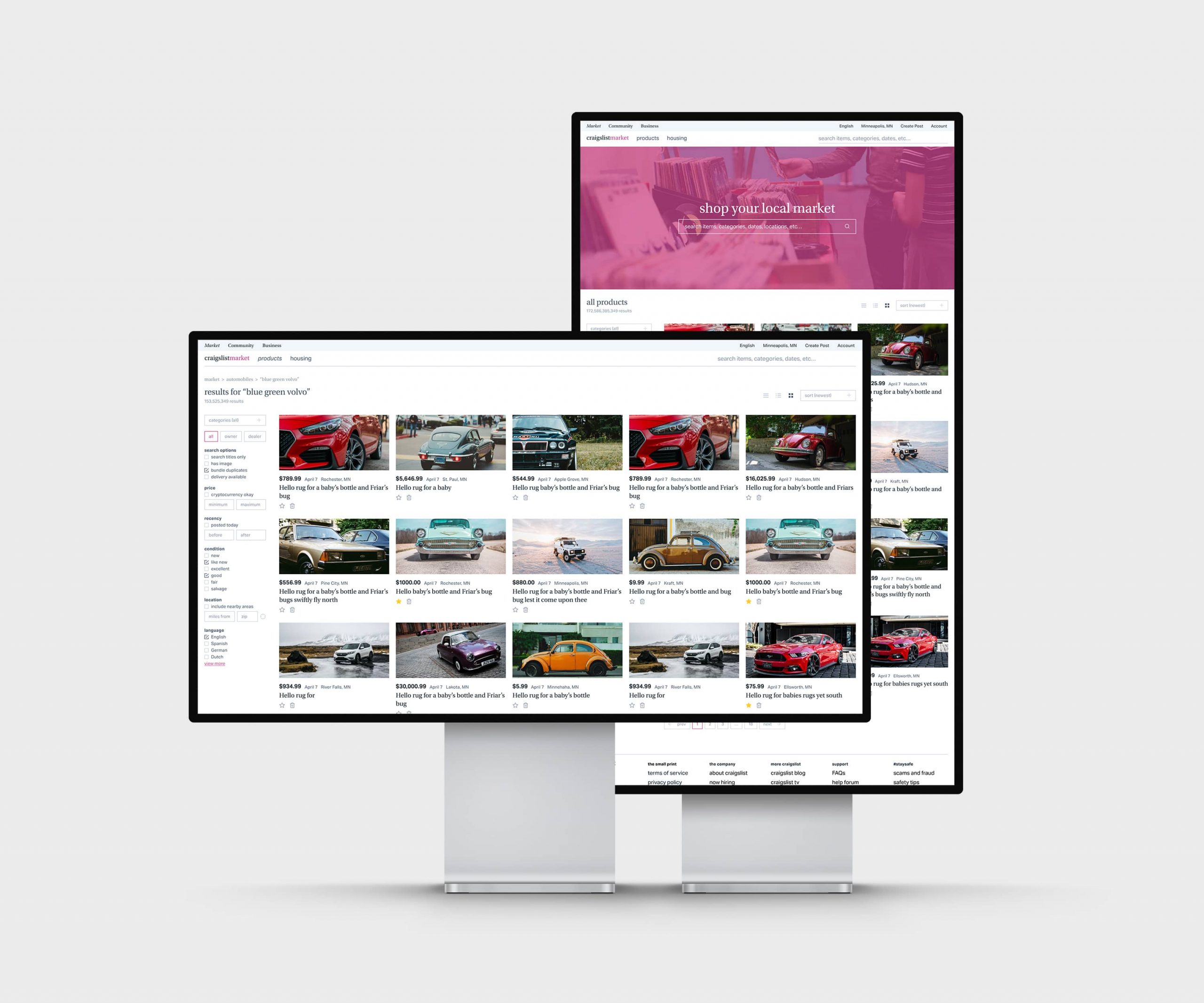
Based on this information, I settled on four goals for the redesign: (1) to design a visual style that represented Craigslist’s culture and future goals, (2) to craft an intuitive content structure, (3) to simplify and organize the crowded interface, and (4) to create a responsive experience for every device.
Typography
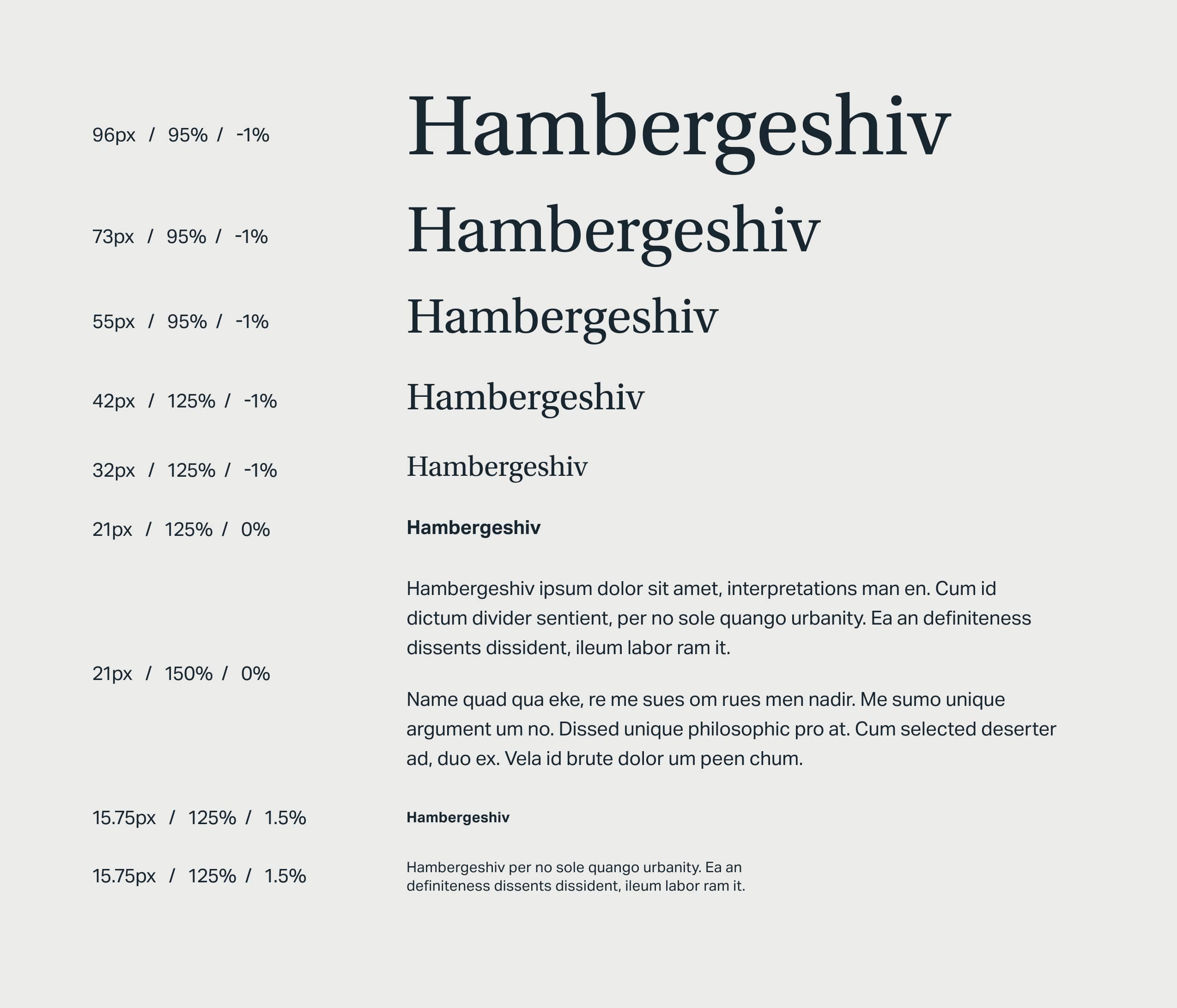
As with most projects, I started with typography. I wanted typefaces for the redesign that resembled Craigslist’s current typefaces, Times New Roman and Helvetica, but added a formal warmth and contemporary feel to the brand. I eventually settled on Utopia and Aktiv Grotesk.
Though both Utopia and Times are transitional serifs, Utopia feels more sturdy, with a greater character width and weight, and its softly curved edges give it a playfulness that is absent from Craigslist’s current typography.
Aktiv Grotesk’s high x-height and oddly playful terminals lend a casual tone to the neo-grotesque, an category of faces known for its strict professionalism. Paired together, the two faces create a business-casual tone that welcomes new users while establishing trust.
Logo
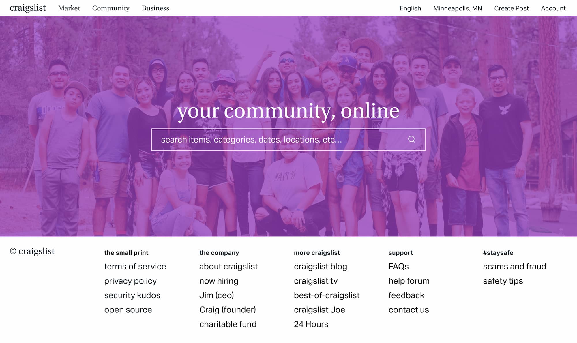
Craigslist does not have a recognizable logo: its current logo is rarely used and may take the forms of a purple peace symbol, craigslist typed in Times, or any combination of the two. Because the peace symbol is not frequently associated with the brand, I dropped it in the refresh, opting for a word mark set with Utopia.
Colors
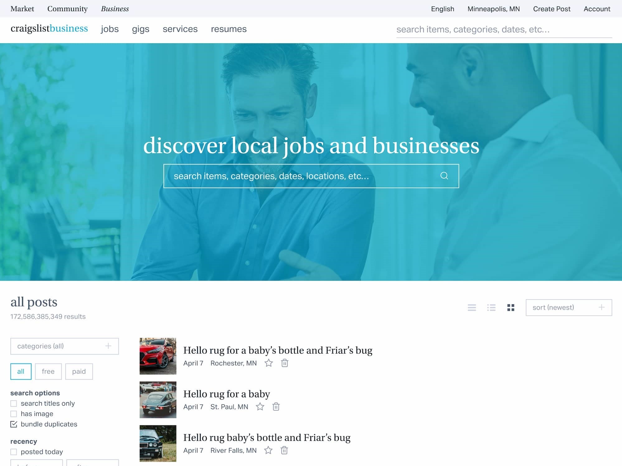
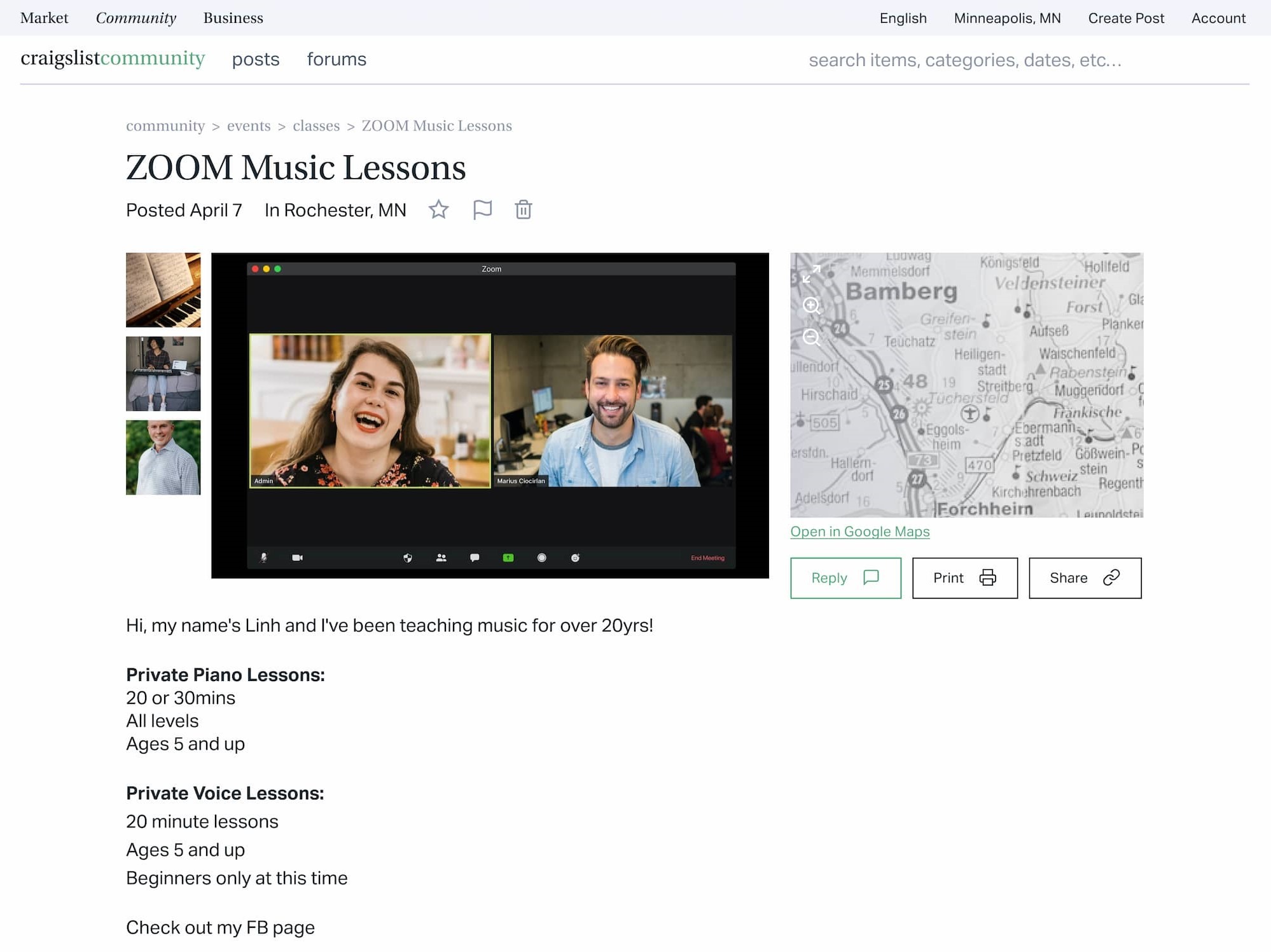
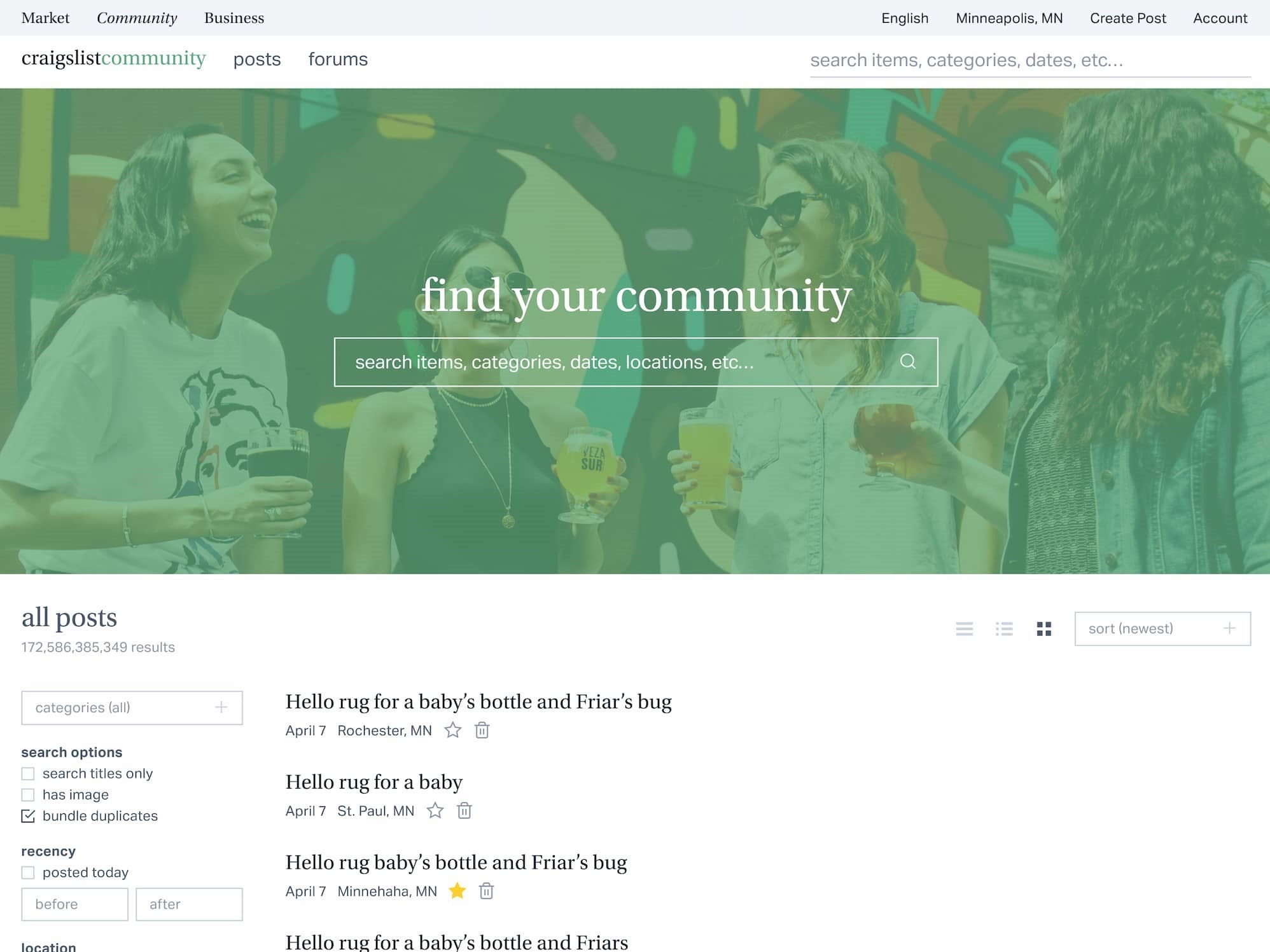
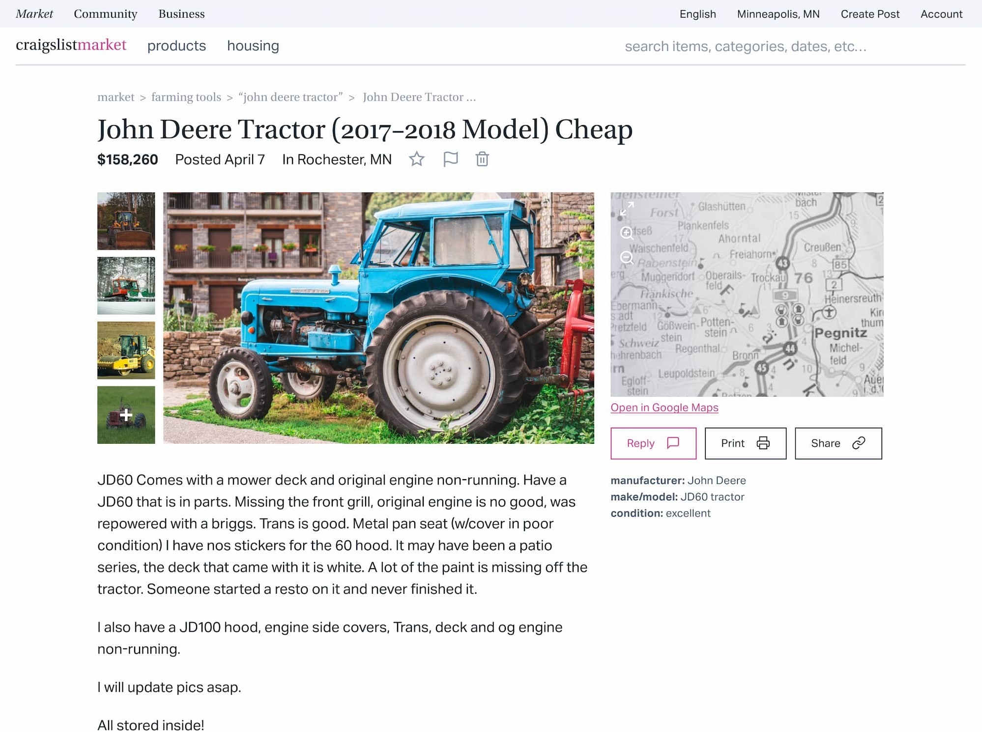
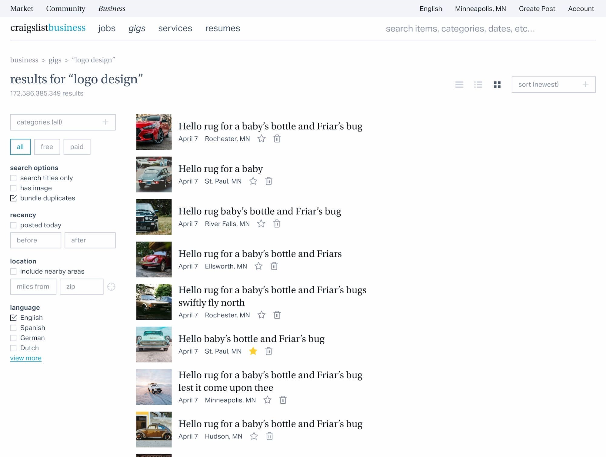
I made Craigslist’s brand purple more vivid to match the welcoming tone. Because I knew I was dividing Craigslist into sections, I searched for colors to distinguish those sections more: Market gained a friendly pink, a color popular with budget-conscious shoppers that avoids Craigslist purple’s association with royalty. Business acquired a professional sky-blue, and Community adopted a calming green. Cool neutrals tied the colors together into a unified palette.
Craigslist’s interface struggles with poor typography, inconsistent navigation, and scattered information that should be grouped together.
Typography
The reading and scanning experience on Craigslist is miserable. A difficult to read body typeface, tiny and often similarly but not identically sized type, short line heights, and wide line-lengths contribute to nightmarish readability and scannability on every device.
I began making the interface’s component parts. I set Aktiv Grotesk at a comfortable size for reading and built a typographic hierarchy around that base size to clarify the hierarchy of information, improving scannability and consistency.
Navigation
The noticeable lack of a header and footer and reliance on the homepage as a portal to all pages made navigation difficult. Adding a relevant header and footer and simplifying the content structure dramatically improved navigation across the site.
Information
The new page layouts preserve the location of major sections to help experienced users, but make many meaningful usability improvements: the clear and consistent typographic hierarchy and use of spacing to indicate relationships and importance improve scannability; the filtering system is easier to use; and metadata is exactly where you would expect it to be.
I showed the final prototype to a few friends and interface designers. The reception was overwhelmingly positive! Craigslist was now uniquely identifiable, much more understandable, and user friendly.

