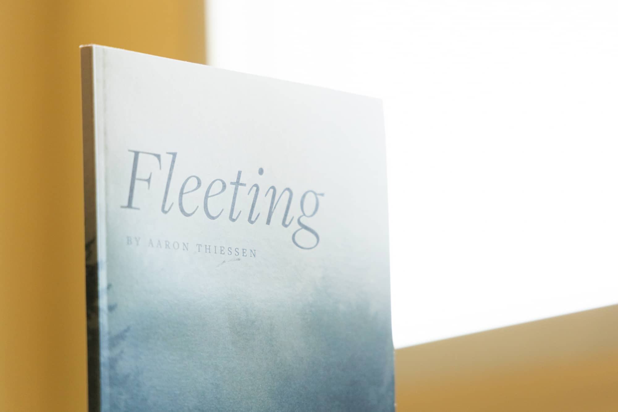
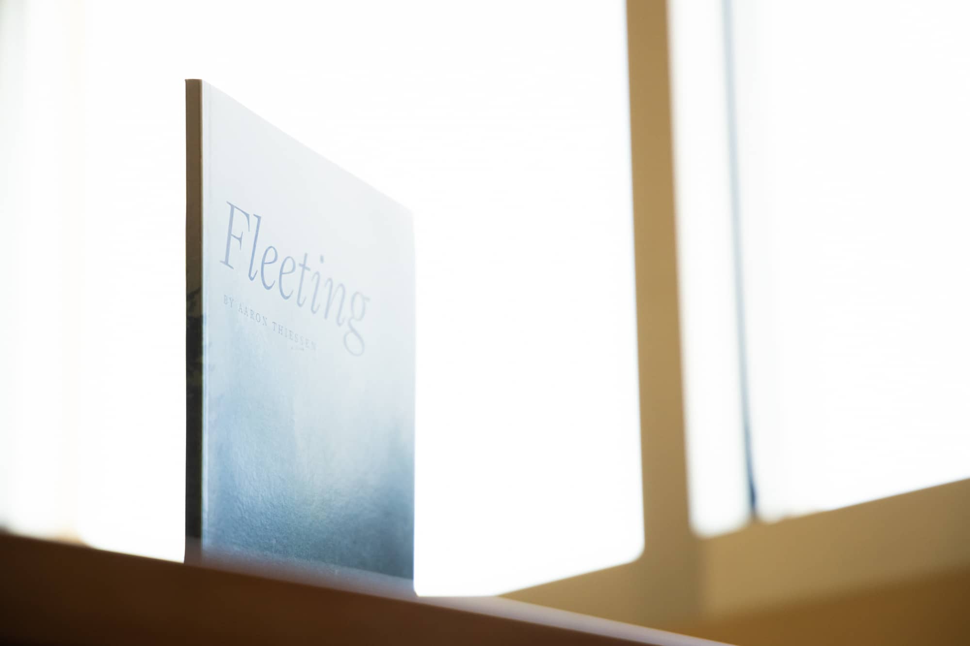
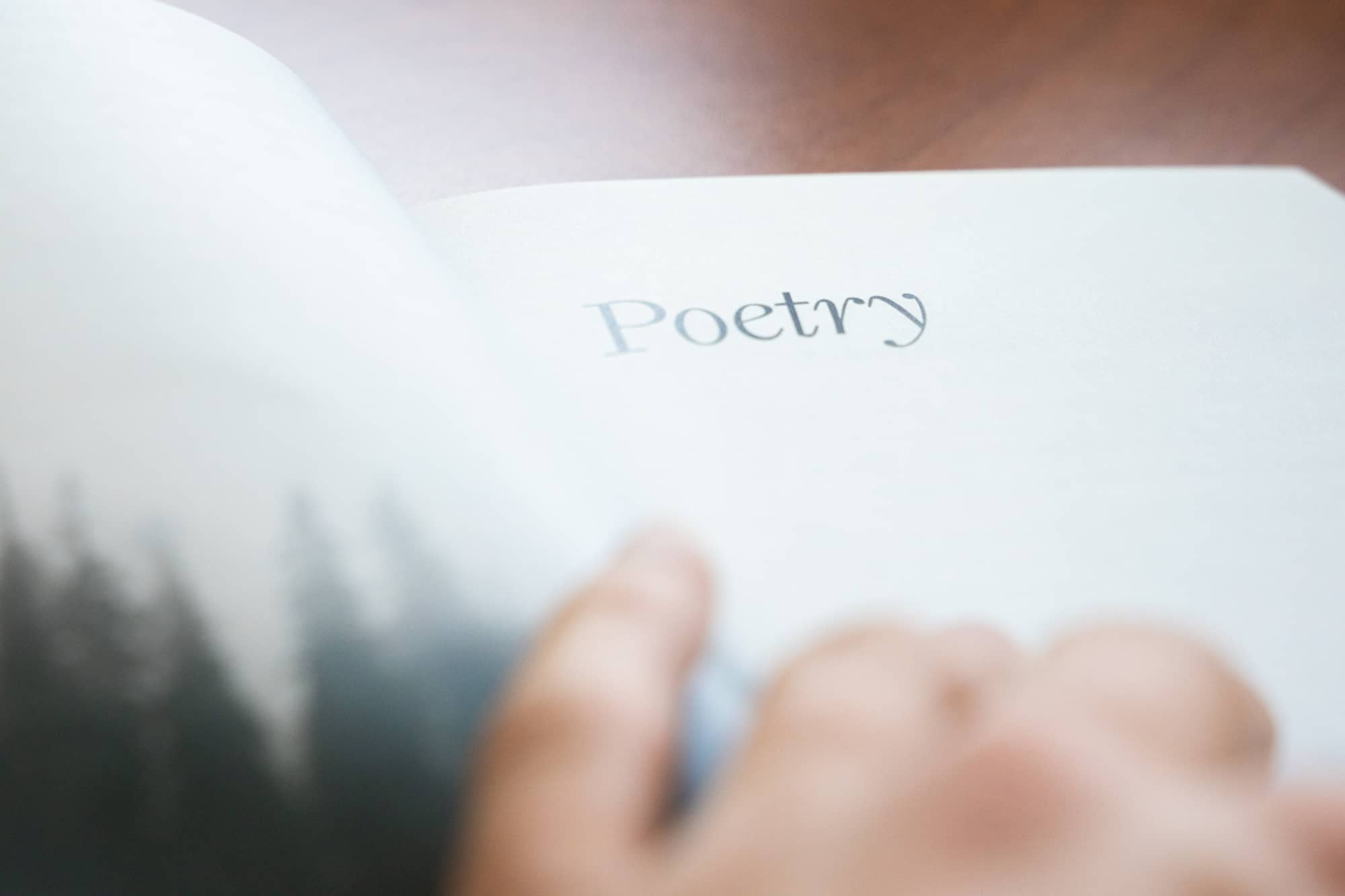
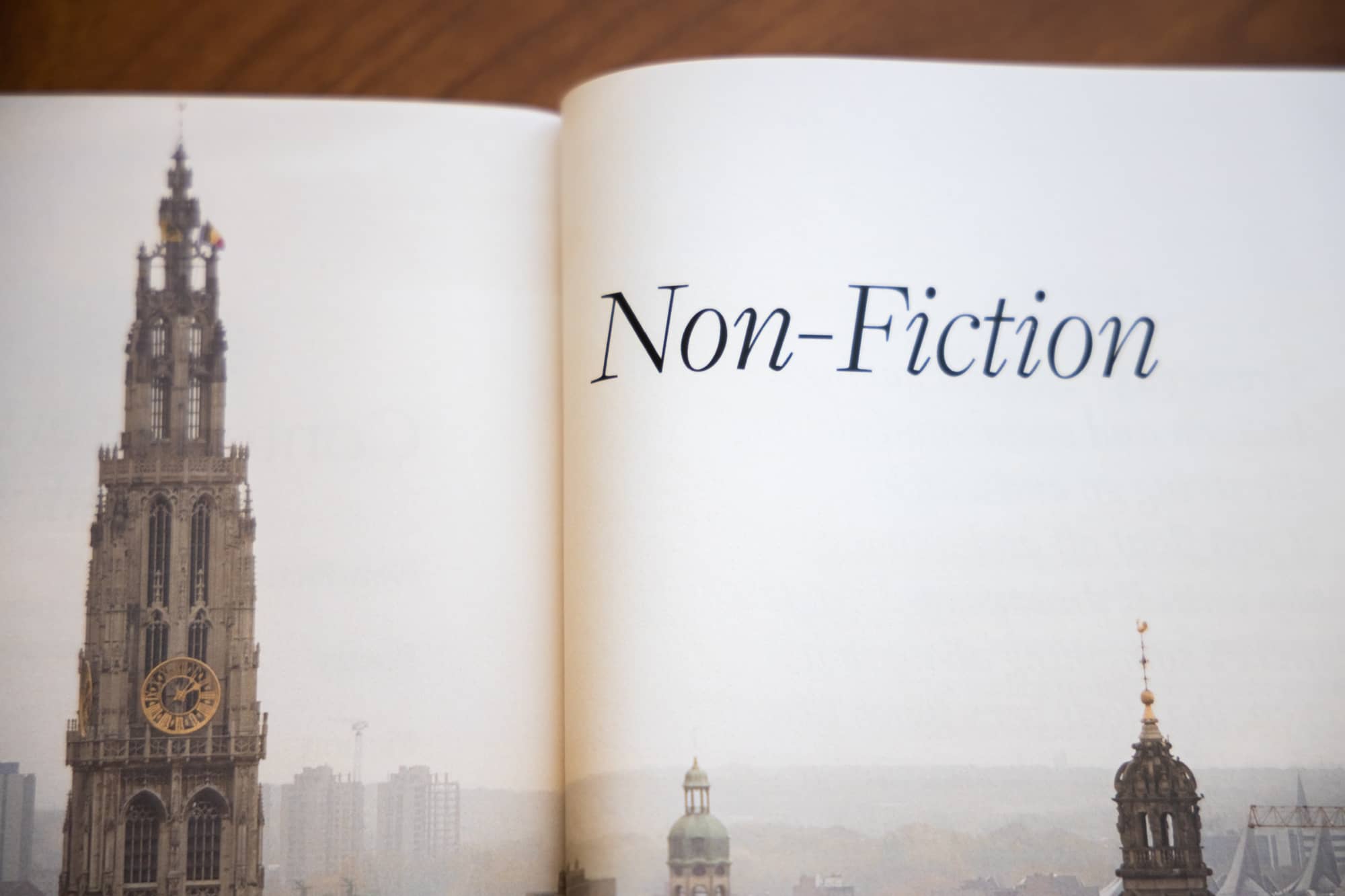
Students in the English Secondary Education program at West Coast Baptist College spend their last year creating a capstone project: a collection of essays, short stories, and poems on a personal theme compiled into a scrapbook and displayed for the student body.
While most students can communicate their theme through their writing, they struggle to design the scrapbook in a way that reinforces that theme. With permission from his teacher, Aaron Thiessen asked me for help. He had chosen a difficult theme—the fleeting nature of life—and was unsure of how to bring his vision to life on the pages of his scrapbook.
Our first meetings dug into his goals for the book and the emotions and themes of the writings in it. We decided the goal for the book’s design wasn’t to echo his writings’ theme, but to set the tone for his writings to be taken seriously—to encourage the reader toward introspection and appear authoritative.
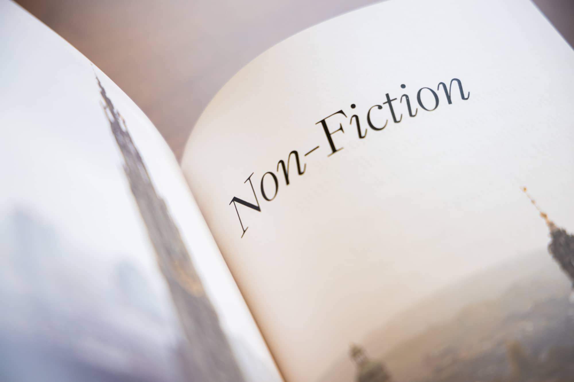
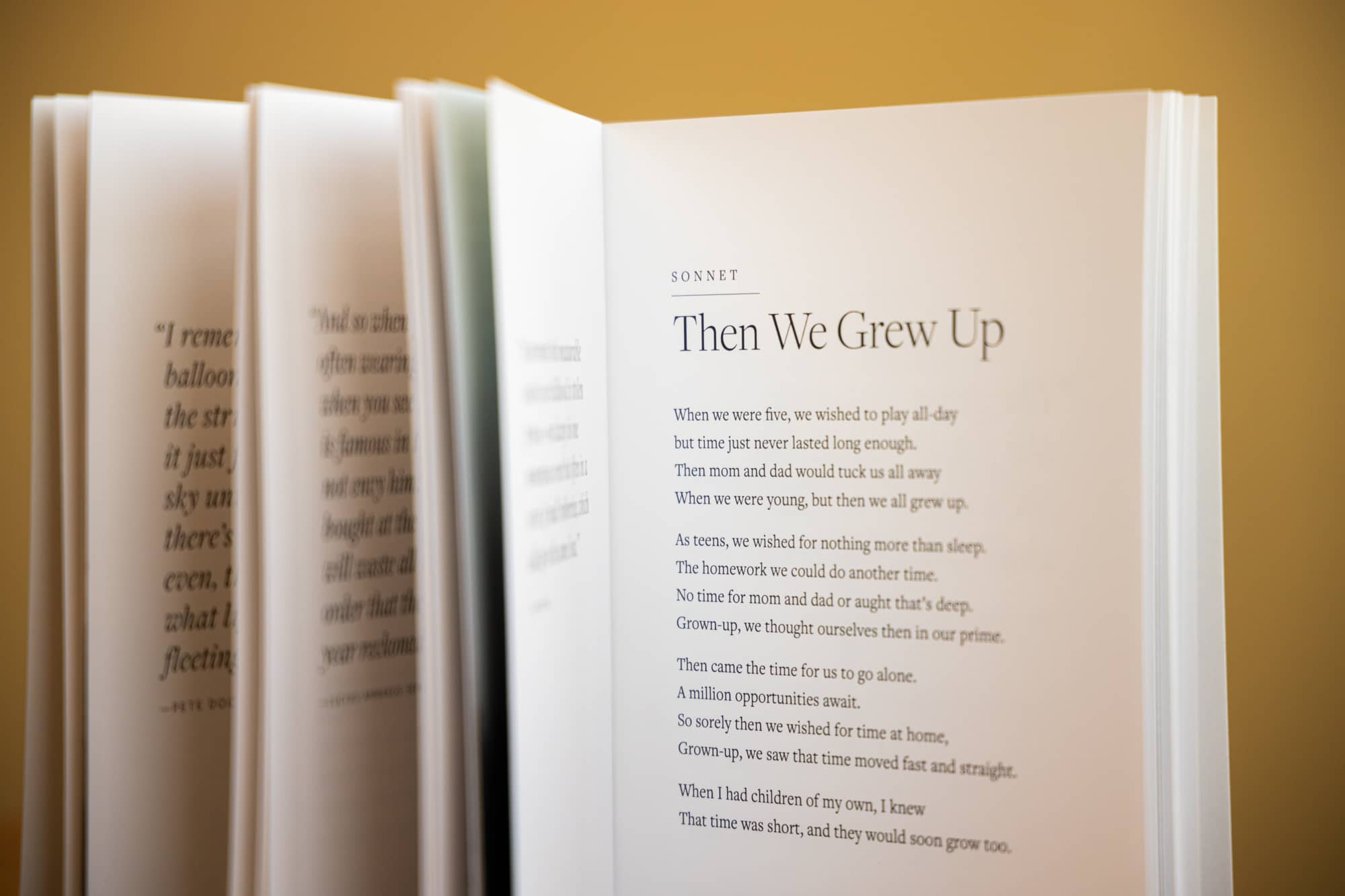
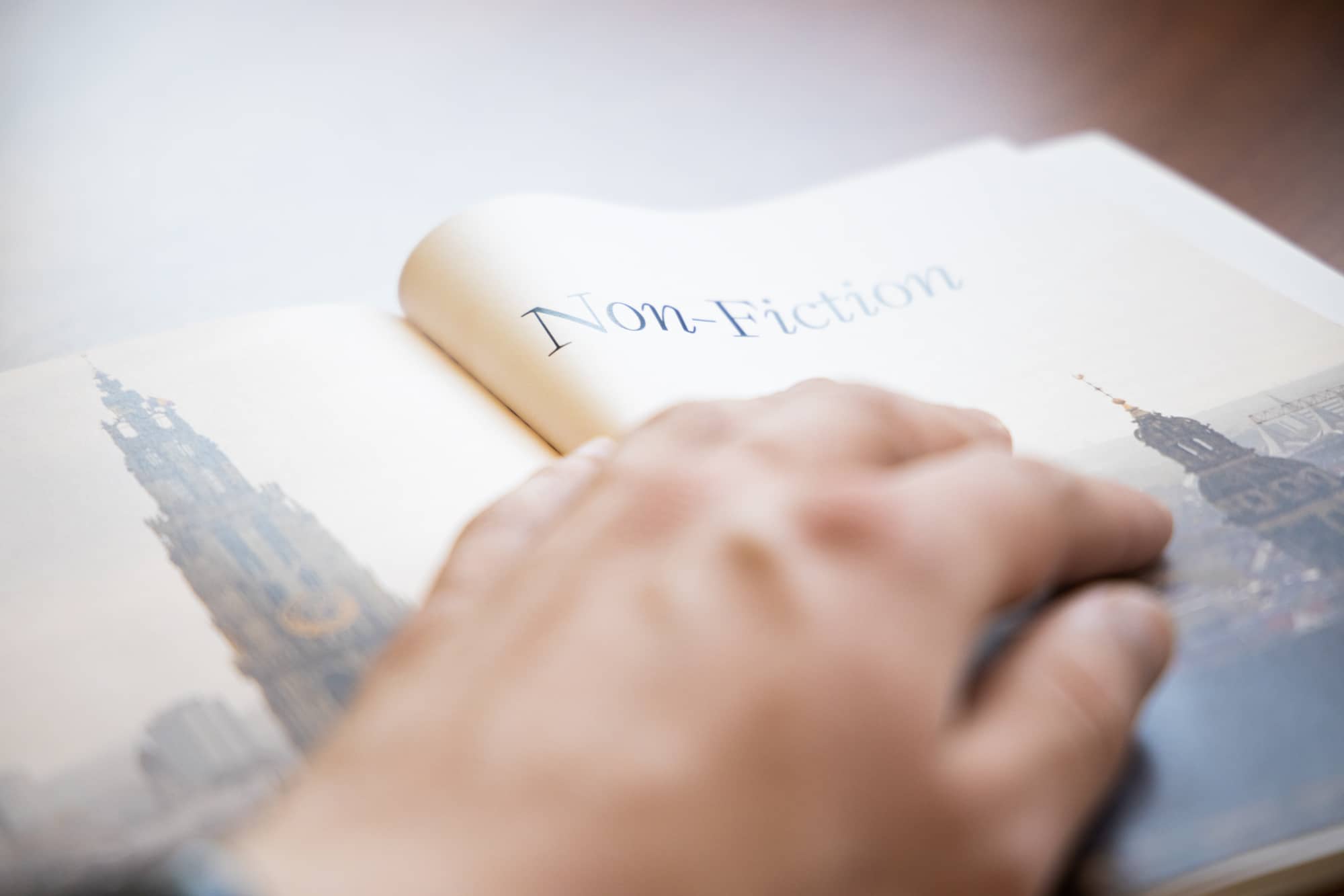
I then set out to discover how to create that tone. After combing through photographs, layouts, and typefaces for inspiration, I settled on formal layouts with plenty of white space; rigid, historical typography; and calm, foggy nature photography.
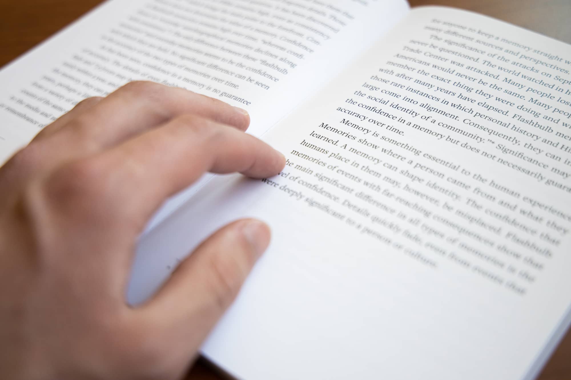
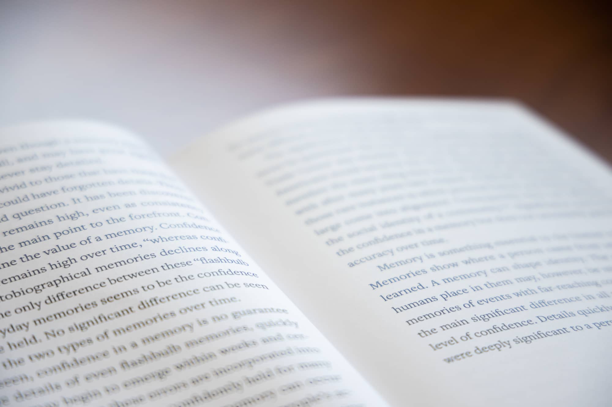
The choice of a formal layout style puts the focus on the words instead of the layout which encourages readers to read and consider the text, and the historical typography adds a trustworthy, experienced weight to the text.
Now that I had a visual style, I worked to define my typography. I chose Joshua Darden’s excellent Freight superfamily for its academic, formal feel, comfortable reading experience, and gorgeously blocky italics. Its contemporary reinvention of historical forms perfectly set the tone for a philosophical discussion of life and death.
After a few layout revisions based on Aaron’s feedback, we exported the final design and handed them to Aaron’s teacher to be printed.
The final design encourages the reader to think about the fleeting nature of life by creating an reading experience devoid of distraction, elevates its material through elegant typography, and stands out among Aaron’s fellow students’ scrapbooks.

